UP504 • How to make good tables and graphs, and to make the most of computer software
last updated: Monday, February 4, 2008 0:00 AM
Dates: February 6, 11

|
UP504 • How to make good tables and graphs, and to make the most of computer softwarelast updated: Monday, February 4, 2008 0:00 AM |
Dates: February 6, 11 |
|
| sections of this page: Conceptual level Graphing in the Digital Age Tufte's principles Practical issues Guidelines for good graphics Problems with percentages and growth rates |
Examples of excel files: tv show preferences world cities radio allocation chart (pdf) |
Readings:
Tufte, Edward R. 1997. Visual & Statistical Thinking : Displays of Evidence for Decision Making: Graphics Press.
Myers, Dowell. "Ch 5: Strategies of Presentation," in Analysis with Local Census Data. New York, NY: Academic Press, Inc. 1992, pp. 97-125. [electronic reserves]
see also:
The Economist, "Worth a thousand words: A good graphic can tell a story, bring a lump to the throat, even change policies. Here are three of history's best." Dec 19th 2007
From print edition
Tufte, Edward. 1983. The Visual Display of Quantitative Information. Cheshire, Conn: Graphics Press. (Note: the ideas on this page are particularly influenced by Tufte's writings.)
Schmid, Calvin F. 1983. Statistical Graphics. New York: Wiley.
Tufte, Edward. 1990. Envisioning Information. Cheshire, Conn: Graphics Press.
also: look through periodicals and journals (e.g., the Journal of the American Planning Association for examples of good and not so good charts).
Click here
to download an example (an MS Word document) of a data table (and common mistakes
made):
Excel 2003 (Windows): Charts | Top tips for Excel: Charts and graphics
Mac OS X: Using Excel X | Choose the best graphics format for the job (including an overview of different graphics formats)
Excel (either Mac or Windows): combines spreadsheets and graphing
(one can use other applications, such as SPSS, SAS, etc.)
2. This leads to a paradoxical
quality of graphic thinking: on the one hand, a graph should be transparent
enough so that the observer sees data and not design (-> data variation not
design variation). YET, the form of the graphic itself shapes the structure
of perception: the assumption that there is a relationship between time and
a variable, or between different variables, or between space and time, etc.
(relate to paradigms).
4. Inductive vs. deductive:
how much to demonstrate a specific point with the graphic vs having the reader/viewer
draw their own conclusions and see their own patterns. NOTE: pure inductive
data presentation seems impossible: all graphics involve choices over what data
to present and not to present.
5. the connection between
good writing and good graphics:
b. show the ideas not the ink (writing, design)
c. be honest; don't confuse with overly complicated design or prose.
d. how about causality? (relational graphs suggest a causal relationship between variables; passive voice avoids the issue of causality -- active voice addresses it, even if inconclusively)
6. Compare:
information (data) to communication (presentation).
The first is latent, the latter is actual. In
planning theory, there is a shift from the former to the latter (e.g., communicative-based
action).
| 100110100001010101011110101001000010101010010011010
110101000010110100101010101000100101010101001010101 010011101010101010101001010101010010101101010101010 101111110000101010011010101001001111111010011001001 111100101010101010101010100010101010101010101010011 001101000101100110100000010010110101001001010100101 |
In this age of digital, the issue of information content is often
seen as data storage.
That is, we emphasize the amount of digital space needed for data
storage: e.g., this Netscape Communicator file (consisting
mostly of text) file is about 48,000 bytes. (Had there been more visuals,
the file size would be MUCH larger.)
1 byte = 8 bits.
a byte
is a group of eight binary digits that can represent an alphanumeric character.
with 8 bits, one can represent 256 distinct combinations of eight ordered
bits (28
=256)
kilobytes (thousand bytes), megabytes (million), gigabytes (billion), terabytes (trillion), etc.
pixel = pix (plural for pic or picture)
+ element
the small discrete elements that make up an
image
"a picture tells a 1000 words."
But there is a difference between data storage vs. effective content
A photo in digital form (a 4*6 inch photo scanned on a scanner at 250 dpi -- dots per inch) may require 6 megabytes of storage, which is 6,000,000 bytes or 1,536,000,000 bits (that is, over 1 billion sets of 0/1 binary bits of data to represent a simple snapshot -- and still at a lower visual quality than the standard drugstore photo print.) Typical digital cameras (as of early 2002) record images 1-2 MB, while the better ones have 4-5 MB. Standard 35mm slide film is generally still more detailed (but digital is catching up).
Therefore: a picture may tell a thousand
words, but require 6 million bytes (6 megabytes) to be stored digitally.
1000 words may require just about 6,000 bytes to store.
In other words, one digital picture requires
as much storage space as 1000 words * 1000 = 1,000,000 words (which is equal
to about 10 books!)
Another example: a color pie chart, generated
by Excel, depicting the percentage of men vs. women in planning, contains just
a single data point. Yet the pie chart image itself, stored digitally,
might require 6,000 bytes, which is 1,536,000 bits (1 or 0 elements).
This explosion in memory has allowed for a far greater gap between data storage size and effective content. One might not worry about this, since memory is so cheap and abundant. But it has arguably led to a cluttered computer screen, a loss of the programmer's former elegant parsimonious use of memory, and an emphasis on facade more than on content and communication.
Why the discrepancy between data storage size and effective content?
So why digitize images if they are so data
intensive and of lower visual quality?
This is the digital age: allows for images
to be standardized, manipulated, and transmitted in ways traditional images
cannot. That text, data, graphs, photographs, drawings, sound, etc., can
all be stored and transmitted in a single, standardized format (e.g., CD-rom,
modem lines, etc.)
An Example:
| An 8x10 inch color photograph made from a 35 mm negative (traditional silver-based film processed in a darkroom) | a digital image (e.g., taken with a digital camera; or a scanned photograph; or a scanned slide transparency) | |
| Storage | image can be stored as a negative film strip or as
a print this "storage" is an inexpensive technology |
stored digitally. thus is treated the same as text, sound, etc. (e.g., ISDN). with high quality images, a high data storage requirement needed. |
| Image quality | the image quality is potentially quite high (depending
on the quality of the camera optics, the film, the paper and the processing.)
easy to increase or decrease the size of the image (through magnification of the enlarger image) |
image quality is not as high, though getting better |
| Modification of the single image | hard to modify the image (except through "dodging" and other darkroom techniques) | much easier and with far more possibilities (e.g., with Photoshop software). |
| combination of multiple images | not easy: either through double exposure techniques or collage cut-and-paste. | much easier and with far more possibilities |
| transference of image Copying Image |
the photo can be mailed the photo can be sent by wire or fax after first converted to dots. (with loss of quality) each subsequent copy leads to a reduction in quality from the original |
quite easy (as easy as any other form of digital information)
one can make an identical copy |
2. then perform basic arithmetic (sums, averages, etc.)
3. then to show univariate patterns in the data
4. then to reveal patterns between two or more variables (e.g., correlation) -- and to show that these relationships are statistically significant (that is, the patterns in the sample data reflect patterns in the population as a whole).
5. then to understand causal relationships
6. to recognize the difference between relationships that can be changed and those that can't (policy evaluation)
7. Finally, to relate to the larger context of the world outside the data set.
Relate to Kant time and space as categories of
the mind: the first way we classify sensation. (as paraphrased by Durant):
1. "show the data" [p. 13]
2. "induce the viewer think about substance rather than about methodology, graphic design, technology of graphic production, or something else" [p. 13] (i.e., transparent and revealing)
3. "avoid distorting" [p. 13]
4. "present many numbers in a small space." [p. 13] [data density]
5. "make large data sets coherent" [p. 13] [communication, not just information]
6. "encourage the eye to compare different pieces of data" [p. 13]
7. "reveal the data at different levels: from a broad overview to the fine structure" [p. 13]
8. "serve a reasonably clear function:
description, exploration, tabulation, or decoration." [p.
13]
a table?
a chart?
text?
a photo or slide? (and digital or traditional silver-based film?)
a map? (and a hand-drawn paper map, a vector-based (polygons) GIS map, or a raster-based (grid) GIS map?)
a drawing?
a site plan?
? All are forms
of representation, with advantages and drawbacks. Don't automatically
graph everything: a shortcoming of EXCEL and Lotus: the ease to graph. Create
a graph because it communicates something substantial and meaningful that the
other formats cannot.
GOAL: give the viewer the greatest number
of ideas, in the shortest time, with the least amount of ink, in the smallest
space.
graph: lots of data, to be compared, multivariate; little text/labels.
tables: small, non comparative, highly
labeled data sets, often univariate.
one rule of thumb: what is the Tufte information/ink
ratio for the two approaches? which one is less?
2. what kind of chart? pie,
bar, column, scatter, line, etc.
varies by the number of variables and cases, the
amount of labels, the continuity or discontinuity of data over time, etc.
3. dimensions of data
vs. dimensions of graphs (general rule: don't have
more visual dimensions than information dimensions. i.e., avoid 3-d graphs).
4. complexity vs. simplicity: how much information does the graph include? how much does the reader readily pick up? What is just chart-junk? (This is Tufte's INK/INFORMATION RATIO) or better:
| 0 -
20 % |
20 -
40 % |
40 -
60 % |
60 -
80 % |
80 -
100 % |
works better than ...
| 0 -
20 % |
20 -
40 % |
40 -
60 % |
60 -
80 % |
80 -
100 % |
or at least use brightness within a color
| 0 -
20 % |
20 -
40 % |
40 -
60 % |
60 -
80 % |
80 -
100 % |
Why? since brightness has an order, but color does not (or at least color has multiple dimensions, which can be confusing)
6. close and far: the first overall look and the
second in depth look (graphs should encourage both)
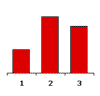
7. Data density: the eye can pick up fine details; most graphs waste this ability to process fine details. (because they often have so little information in them.) e.g., a bar chart of 3 cases; 1 variable. low density of data there. (and why have a chart as all? for decoration and emphasis?). TUFTE is interested more in representing complex, relational data). Remember: graphics can be shrunk way down in size, and the eye can still comprehend.
Low density: can be well less than 1 data entry/square inch. Or as high as 100- 1000s/square inch). Maps can handle higher density, since the reader can arguably (1) easily relate spatial data side-by-side, and (2) it requires little labeling, since one assumes that the reader can interpret a map without labels. (This may be a potential virtue of GIS: geo-coded and spatially displayed data.)
Compare the data density of the following map and this pie chart:
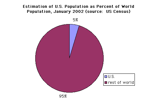
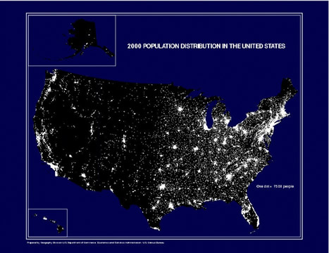
source: http://www.census.gov/geo/www/mapGallery/images/2k_night.jpg
8. Compare to photographs and drawings. Does a
picture tell a 1000 words? or video? when are these effective compared to text
and tables? (especially in this interchangeable world of ISDN?)
9. Know the difference between: unit of
analysis, case, variable, value (of a variable)
| a unit of analysis, | a case | a variable, | a value (of a variable for a specific case) |
| city | e.g., Los Angeles | e.g., the unemployment rate | e.g., 5.2% |
11. Finally, the current challenge to get computer
software to follow the rules of Tufte. Sometimes you may need to import your
half-finished graph into a paint or draw program. And: there is nothing wrong
with hand-drawn visuals!
(based on reading student assignments from past years)
1. Be sure to use a full title for the graphic
(variables, dates, locations, units of analysis). I.e., rather than "Crime and
Infant Mortality," use "Crime Rate per 100,000 Population (1991) and Infant
Death Rate per 1,000 Live Births (1988) in the Largest 40 U.S. Cities". If you
choose to use a shorter title, be sure that somewhere the variables are fully
defined.
2. List the source of the data (just as you would
for a data table.). Anticipate that some readers may simply photocopy your chart
rather than your whole article or dissertation; the graph should be somewhat
self-standing. (Include a descriptive caption at the bottom if useful).
3. Explain and label missing data. Be sure that
the reader knows the difference between a missing value and a zero-value (if
you are not careful, statistical software will treat these two as the same).
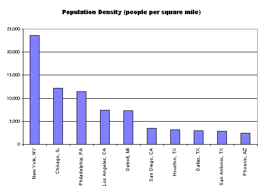
4. Order the chart in some useful way. And if the chart has an ordering to it, be sure to state this (e.g., cities ranked by population size).
alphabetical is not always the best:
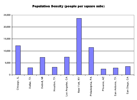
try instead ordering based on some relevant variable (here simply the variable displayed):
5. If you use a subset of the cases, be sure to
explain the logic of the selection (e.g., among the 10 largest U.S. Cities).
6. Label the x and y axes.
7. Use a legend or labels to define variables
in a multivariate bar or column chart. You do not need a legend for a
univariate chart.
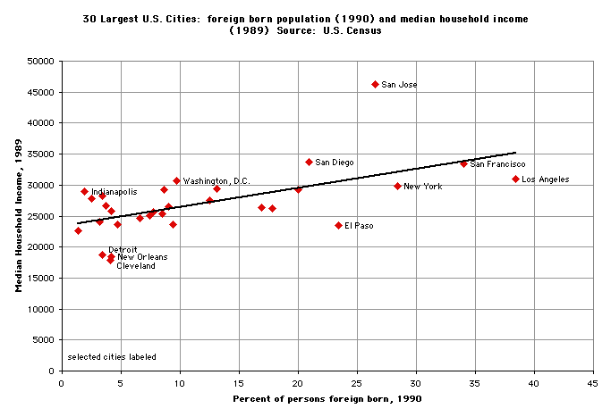
8. Often an x-y scatterplot is preferable to a bar chart (or column chart) with two variables. Scatterplots use less ink, and they usually reveal bivariate relationships (i.e., the relationship between x and y) far better than bar or column charts.
Here is the same bivariate data displayed two ways:
9. It is fine to do a regression analysis, but
be sure to explain your results.
10. Do not add the Hispanic population
with other racial categories (black, Asian, etc.), since the U.S. Census states
that "persons of Hispanic origin may be of any race."
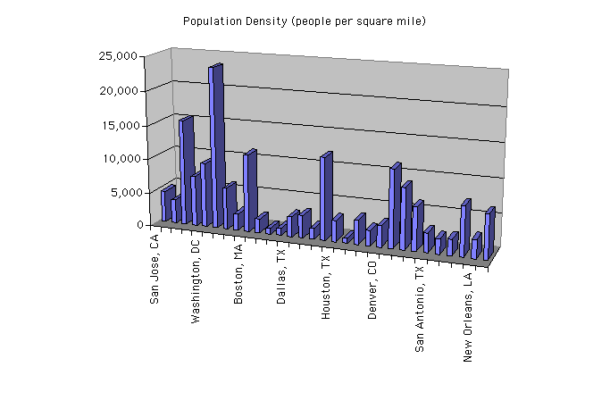
11. Avoid 3-dimensional graphs unless the data itself is 3-dimensional. Even then, 3-d is hard to read.
| |
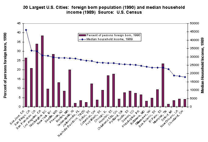
13. Avoid column charts with too many data points: the columns become too narrow (and the labels too small or some not showing) to read easily. (This also applies to bar charts). This problem literally multiplies with multiple variables displayed on one chart. Above about 10-15 data points (e.g., columns), I would consider an alternative format (such as scatterplot, a table, grouping data, etc.). Or use several charts, side-by-side, with the same format (e.g., one for each variable). [see Tufte on the use of "small multiples"]. an example of a problematic chart below:
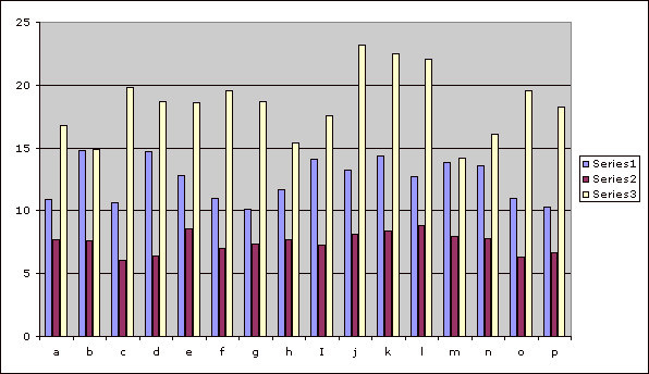
Note how it is really hard to see patterns in the data (with 3 variables and 16 cases). The gray background is distracting too. Best to avoid this type of chart. (Remember: just because Excel can create a chart from your data doesn't mean that it is necessarily a good format for the data.)
14. Overall, show the data; have the view think
the patterns in the data, not the graphic design; avoid distortion; encourage
the eye to compare data; clearly label the graph.
1. how to determine the denominator: think of a survey result: what to do with nonresponses, etc.
2. also: "the percentage effect": a percentage
may go down, when the absolute goes up. How do we interpret? (GIve an example).
Well, it depends on whether the actual theory of phenomenon is better explained
by absolute or percentage.
| |
2,712,190
|
| |
3,226,049
|
| |
3,734,258
|
| |
3,804,048
|
| |
3,879,409
|
| |
4,024,286
|
| |
4,332,834
|
= +2.0% / year
= +1.6% / year
= +1.56% / year
-- e.g., bank interest, rabbits reproducing, etc.