Excel Tutorial
Fitting logarithmic data
First, open excel. you will see a blank worksheet on the screen. Enter the data that you wish to fit into the first two columns. It should look like the first and third columns below
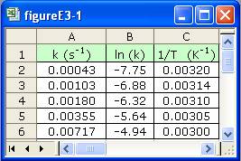
Next, you need to create column B. To do this, click on cell B2. To take the logarithm of the values in the A2 cell, type "=ln(A2)" (omit " "). You can extend this formula down the line by dragging the bottom right corner of the cell and dragging it down for as many cells as you need. In this case, drag it down to cell B6. Now that the data is done, we can move on to actually graphing the data.
To graph the data, first select the relevant data. For the first case, select columns B and C. Now click on the chart wizard. It will be somewhere in the menu bar, with a picture that resembles several vertical bar graphs.
This will bring up the chart wizard. first select the type of chart that you would like to create. In this case select "XY (Scatter)" and then choose the first of the five options that appear. Click on the "Next" button, and then click on the series tab at the top of the new window. Currently, the X and Y axes are switched, so you need to change the cell references, for example, the X values window reads "=Sheet1!$B$2:$B$6" and it should read "=Sheet1!$C$2:$C$6". Simply, change the Cs to Bs and the Bs to Cs in both the X values box and the Y values box. Now click "Next" again. This is the options menu. Here you can add titles, legends or other labels to your chart. This isnt really necesary right now, so click "Next" again. This is the Location Menu. Here you can select if you want your chart to appear in the current worksheet or if a new sheet should be added for the chart. Just click "Finish" for now.
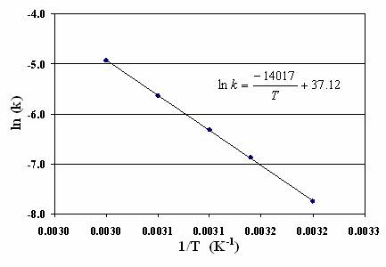
You will now have a chart that looks something like this, but we still need to add the equation and the trendline. To add the trendline, right-click on a point in the series, and select "Add Trendline" from the menu. We need a linear trendline, so this is fine. Click on the "Options" tag at the top of the window. Now check the "Display Equation" checkbox on the bottom left of the window. Now click "Ok". The trendline should now be on your chart, but the equation isnt in the same form. You can change the form of the trendline equation to match that of the equation above simply by clicking on it, then clicking again to allow you to type into the box. If you click too quickly, you will bring up a formatting menu, just close it if this happens.
Now we should try graphing in Excel using logrithmic axes. Create a new chart exactly the same as the last one except using columns A and C instead of B and C. Make sure that the X and Y axes are referencing the correct columns; the X column should be referencing the C column. To put this chart on a semi log axis, right-click on the Y axis, and select "Format Axis" from the menu. Click on the "Scale" tab at the top of the window. Now check the "Logarithmic Scale" box at the bottom of the window, then click "Ok". Your chart should now look something like this.
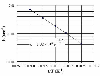
Now we just need to add the trendline. We can do this by again right-clicking a point in the series, and selecting "Add Trendline" from the menu. This time instead of a linear trendline though, we need an exponential trendline, so select "Exponential" from the choices. Then, click the "Options" tab and check the "Show Equation" box. Click "Ok" and the chart should be complete. The equation will again be in a slightly different form from the one above, but this can be changed just as we changed the previous equation.